
Typography anatomy words can feel like a secret language sometimes, but once you learn a few key terms, everything starts to click. This is why I set up this super helpful typography glossary!

This glossary is here to take the confusion out of typography terms and turn them into something that you can actually understand. Instead of overwhelming definitions, you’ll find simple explanations that help you see letters in a whole new way.
Whether you’re working on lettering, designing a project, or just trying to improve how your designs look. Understanding these terms will help you make more confident design choices, fix little details that make a big difference, and create work that feels more polished and intentional.
I also created explanatory graphics to make the terms easier to understand visually, because sometimes seeing the parts of a letter makes everything click so much faster.
So here’s your non-intimidating glossary of typography terms, explained in a way that makes sense (and with visual references and examples to make it make sense!) Don't forget to download the free printable poster at the end of this post.


- Ampersand
- Apex
- Aperture
- Arm
- Ascender
- Axis
- Baseline
- Bowl
- Bracket
- Cap Height
- Counter
- Crossbar
- Descender
- Diacritic
- Ear
- Eye
- Glyph
- Italic
- Kerning
- Leading
- Legibility
- Ligature
- Leg
- Loop or Lobe
- Lowercase
- Negative Space
- Overshoot
- Readability
- Sans-serif
- Serif
- Spine
- Stem
- Stroke
- Swash
- Tail
- Terminal
- Tittle
- Tracking
- Uppercase
- Vertex
- Weight
- White Space
- X-height
- Looking for more letter-making goodness?

Ampersand
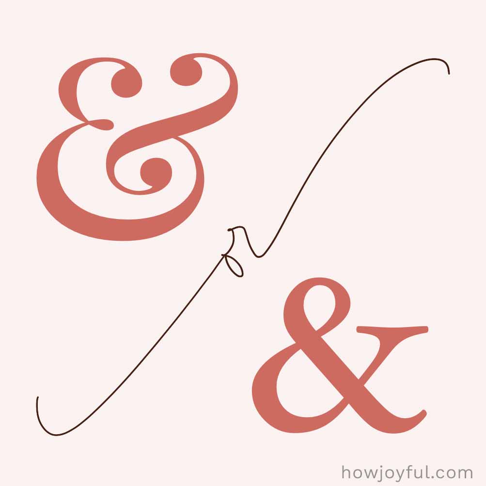
The ampersand (&) is just a stylish way of writing “and.” It's believed to come from the phrase “and per se” and et (Latin for “and”), which over time got shortened into the word we use today. Every so often you can actually see those letters tucked into the design.

Apex
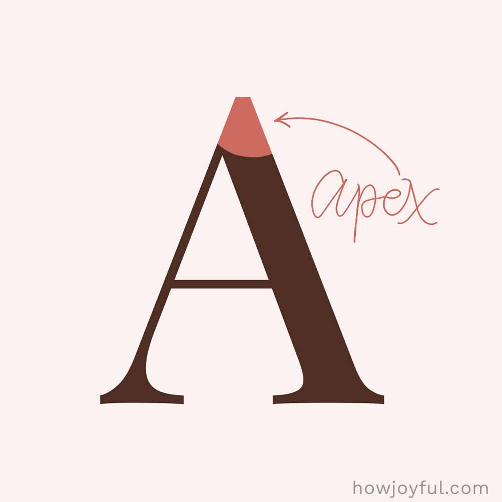
The apex is the very top point where two strokes meet, like the peak of the letters A, M, or W. It’s typically a sharp little detail that helps define the letter’s shape and style. (The bottom version of this point is called a vertex.)

Aperture
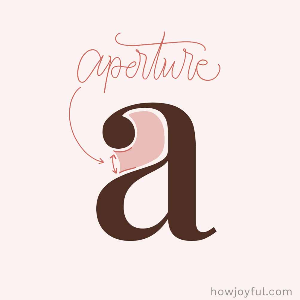
An aperture is the opening in a letter, like the gap you see in c, e, or s. It connects the inside space to the outside, and bigger openings usually make letters feel more open, friendly, and easier to read.

Arm
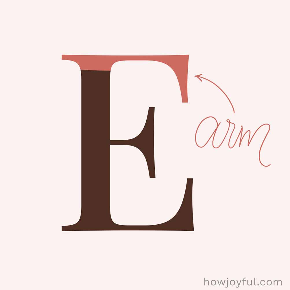
An arm is a stroke that extends out from a letter and is only connected on one side. You’ll see it in letters like T, E, F, and Y. It can be straight or slightly angled, and it helps give the letter its shape and balance.
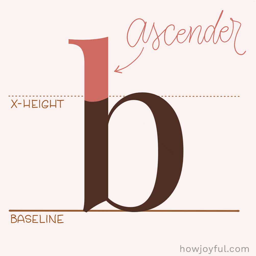

Ascender
The part of a lowercase letter that reaches up above the main body (like in b, d, h, k, l, and t). This is super important in calligraphy for rhythm and spacing.
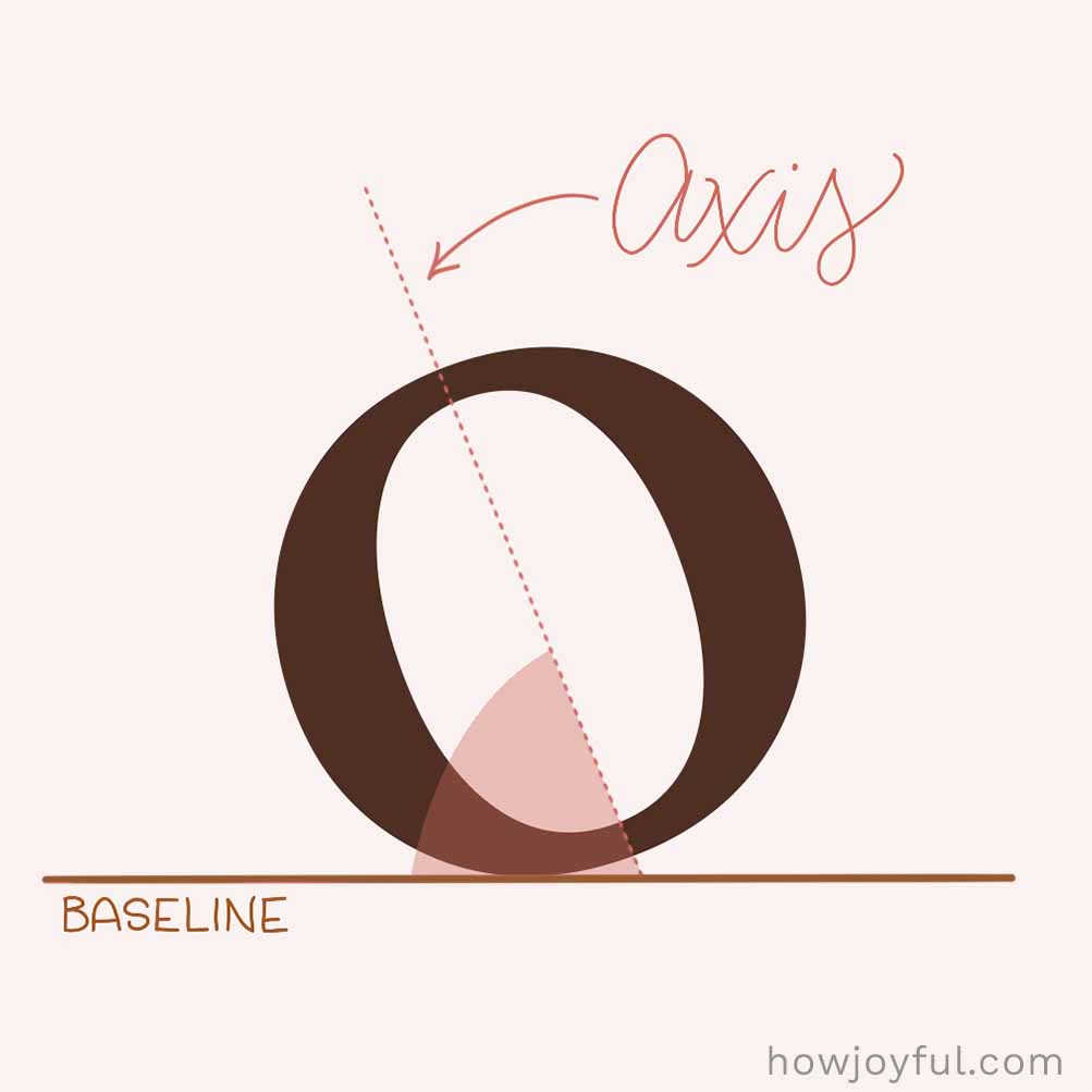

Axis
The axis is an invisible line that shows the direction of thick and thin strokes in a letter. It frequently comes from the angle of the pen, giving the font its overall “flow” or energy, whether that feels more straight and structured or a bit more slanted and organic.
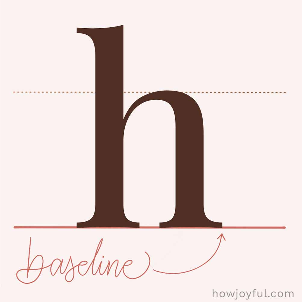

Baseline
The baseline is the invisible line that letters sit on. Most letters rest right on it, while some (like g, j, p, q, and y) dip below. The baseline is essential in keeping your text feeling aligned and steady.
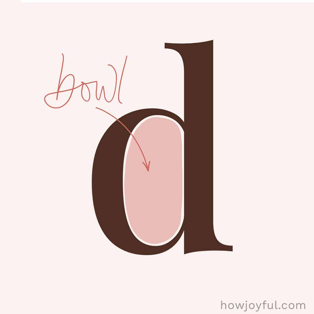

Bowl
A bowl is the rounded, enclosed part of a letter, like in o, b, d, or p. It wraps around the inner space (the counter) and plays a big role in the overall shape and feel of a letter.

Bracket
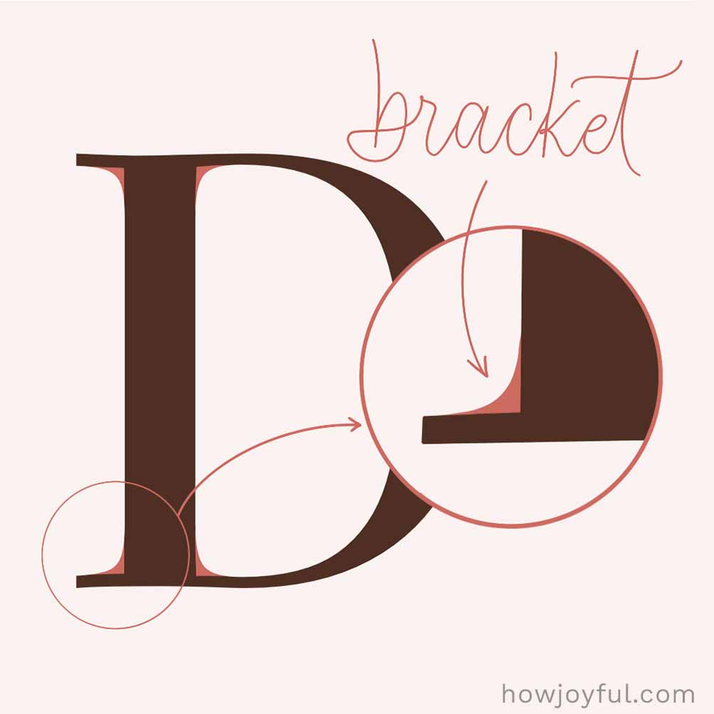
A bracket is the soft curve that connects a serif to the main stroke of a letter. Instead of a sharp edge, it creates a smoother transition, adding a more classic, elegant feel.

Cap Height
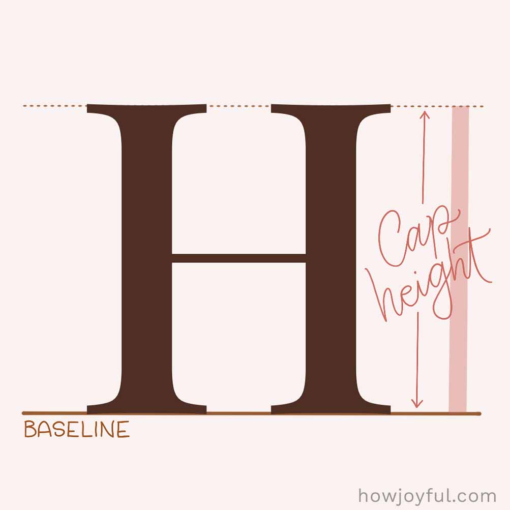
Cap height is the height of uppercase letters in a font; it's measured from the baseline to the top of flat letters like H or I. It helps keep letters aligned and consistent and plays a big role in how balanced a font feels.

Counter
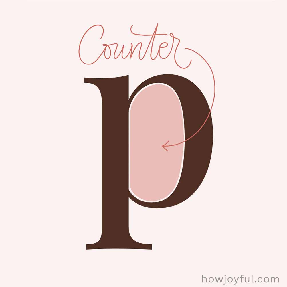
A counter is the empty space inside a letter; you can see the “hole” in the letters o, p, or a. Some counters are fully closed, while others are more open, but either way, they play a big role in how easy a letter is to read.

Crossbar
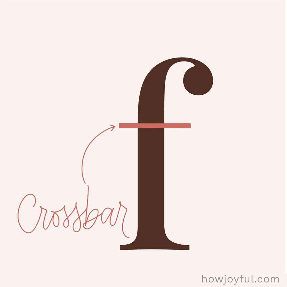
A crossbar is the horizontal line that connects or crosses a letter. Like in the letters A, H, t, or f. It helps hold the letter together and can shift slightly up or down depending on the style, changing the overall feel.
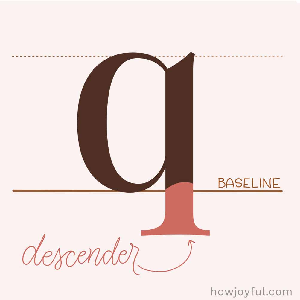

Descender
A descender is the part of a letter that drops below the baseline, like in the letters g, j, p, q, and y. These lower strokes help create that nice up-and-down rhythm in lettering and make letters easier to recognize.
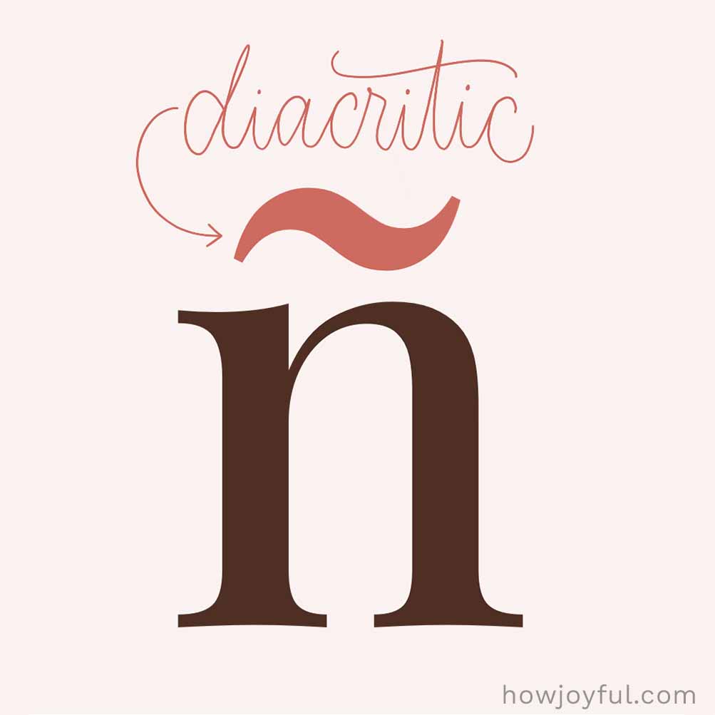

Diacritic
A diacritic is a small mark added to a letter. They are essential in many languages for clarity and phonetic guidance, like in é, ñ, or ü. It can change how the letter sounds or its pronunciation and add a little extra detail to the character.
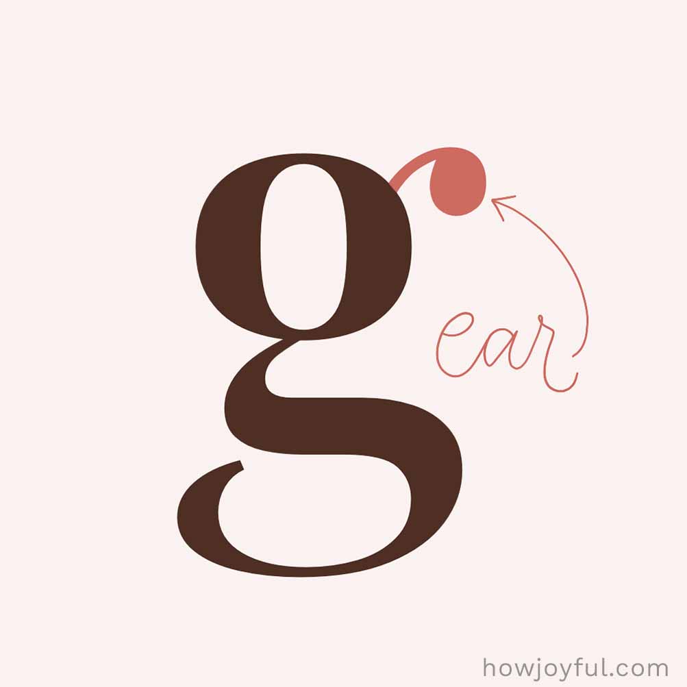

Ear
An ear is the tiny little stroke or serif that sticks out from a lowercase g (and sometimes r). It usually comes off the upper right side and adds a bit of personality to the letter, helping to distinguish font styles.
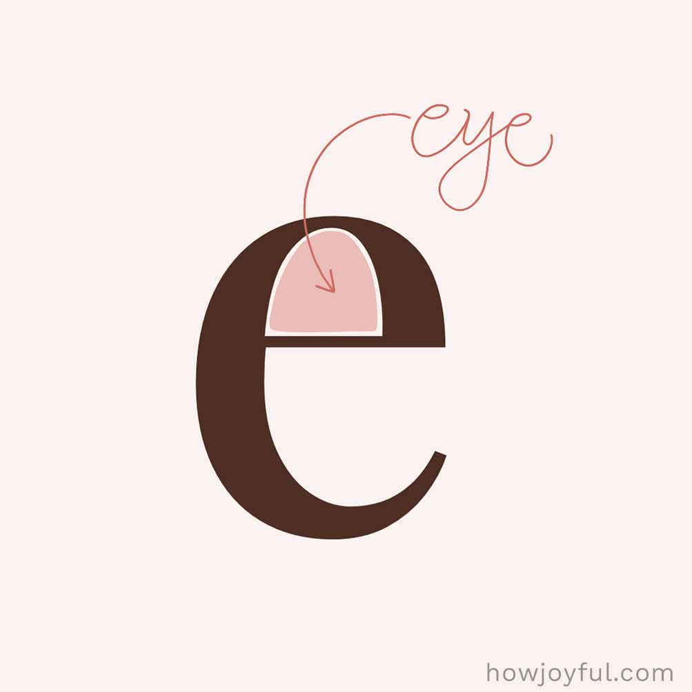

Eye
The eye is the small enclosed space inside a lowercase e. It’s basically the “counter” of the e, but it has its own name because it’s such a unique little shape.

Glyph
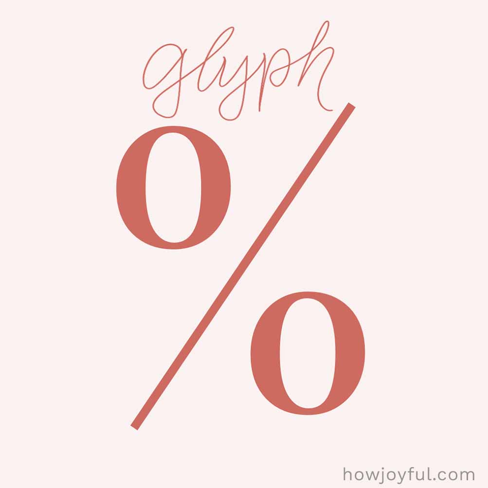
A glyph is the actual drawn version of a character. Like the specific way a letter, number, or symbol looks in a font. So while a “character” is the idea (like the letter a), the glyph is the visual design you see on the page.

Italic
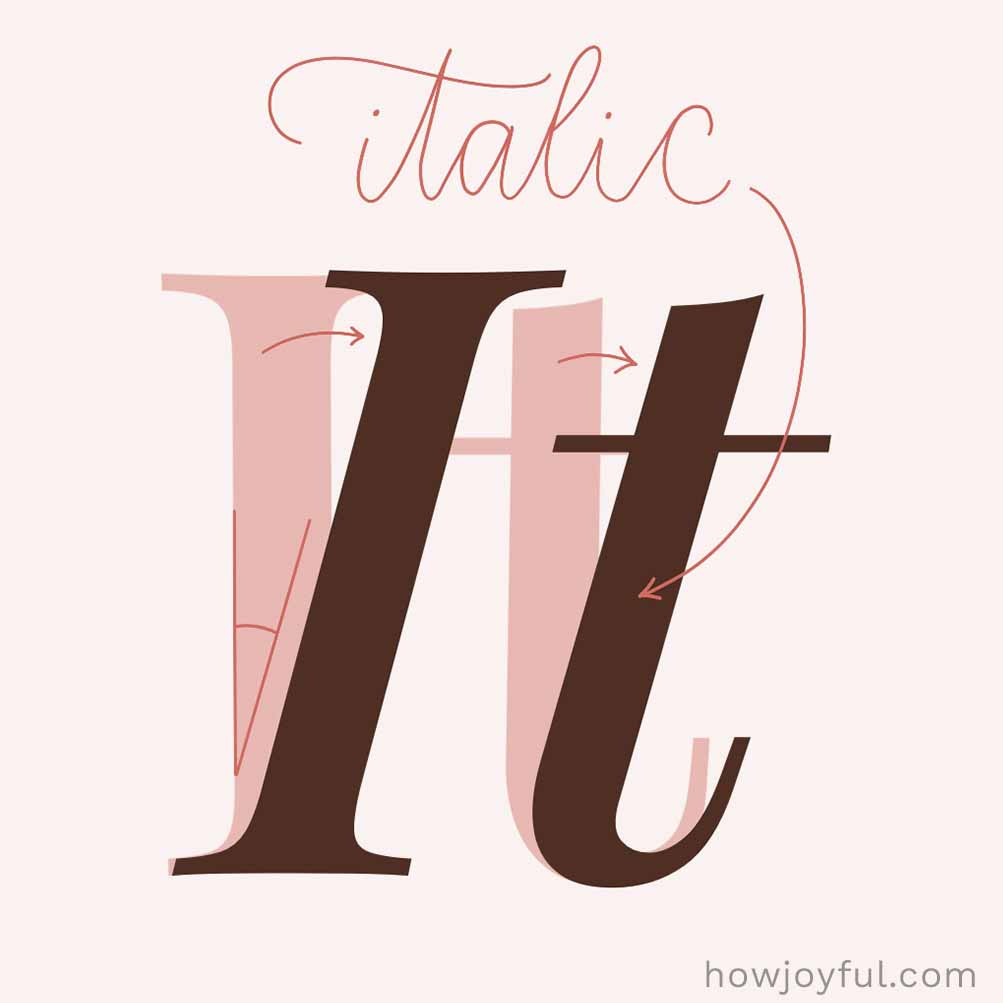
Italic, or italicized text, is a slanted version of a font used to add emphasis or highlight something special. It’s often used for titles, foreign words, or to give a little extra attention to certain words.

Kerning
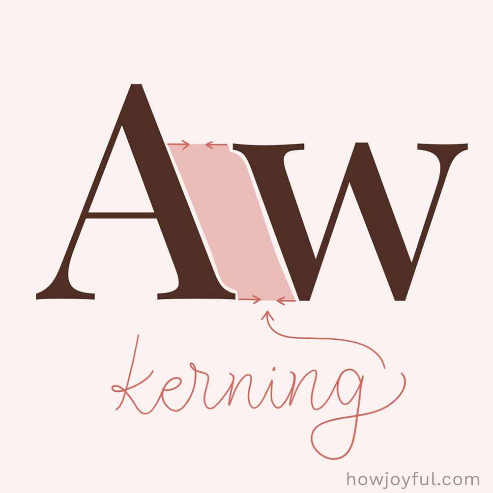
Kerning is adjusting the space between specific letter pairs. Unlike tracking, which adjusts spacing uniformly across a word, kerning helps fix awkward gaps between individual letters (like in VA or To) so everything looks balanced and feels just right.

Leading
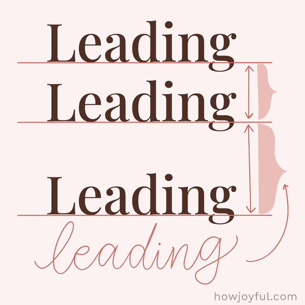
Leading (pronounced ledding) is the space between lines of text. It helps your text feel balanced and easy to read, not too cramped, not too spread out. In digital design, you’ll frequently see it called line height.
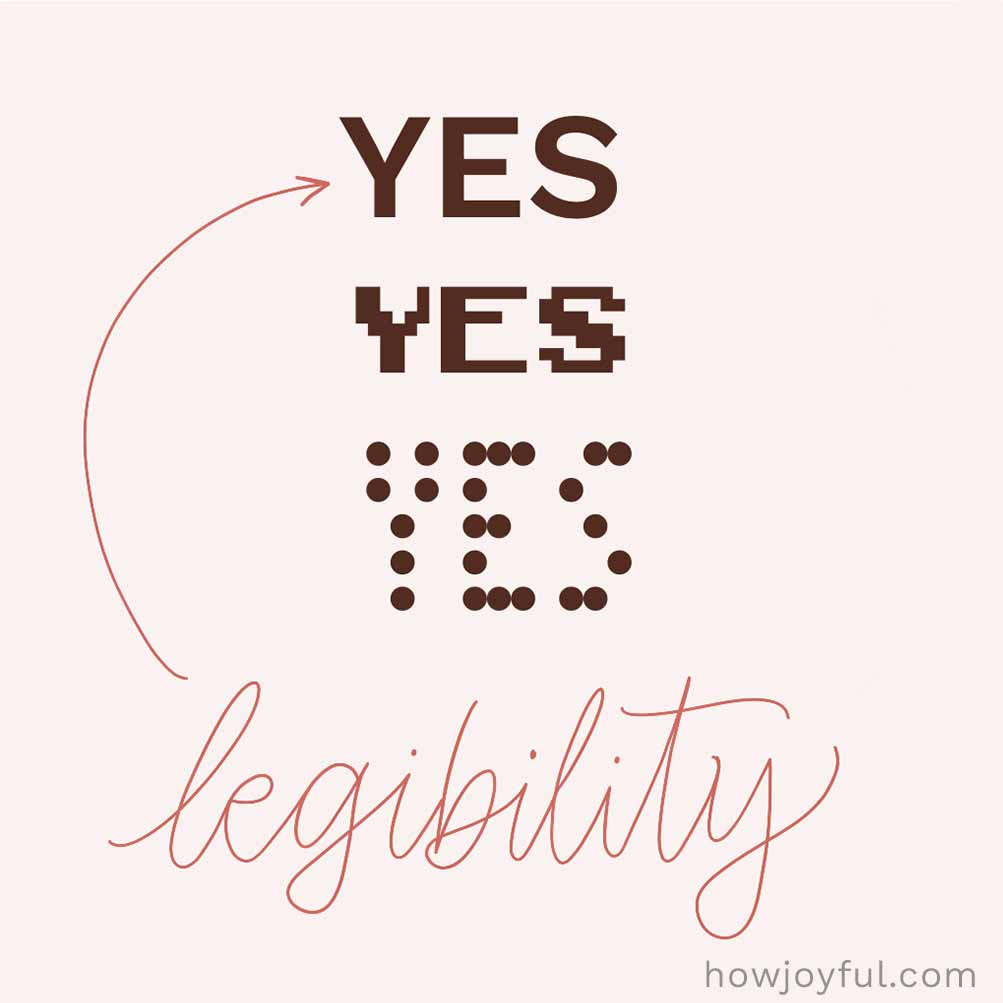

Legibility
Legibility is how easy it is to recognize individual letters. It’s all about the letter shapes themselves; clear, distinct forms make text easier to read at a glance.
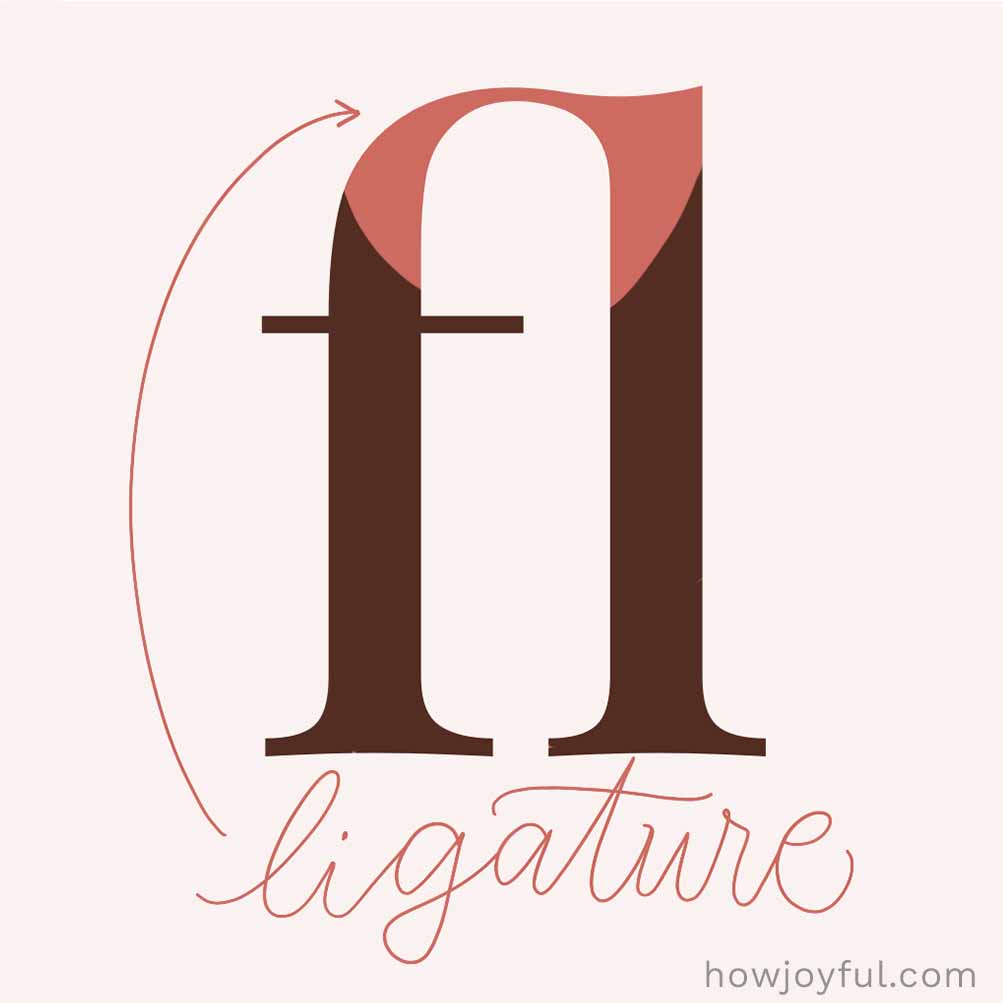

Ligature
A ligature is when two (or more) letters are joined into a single, smoother shape—like fi, fl, or ff. They help prevent awkward overlaps and make text flow more nicely. A tiny detail that makes everything feel more polished.
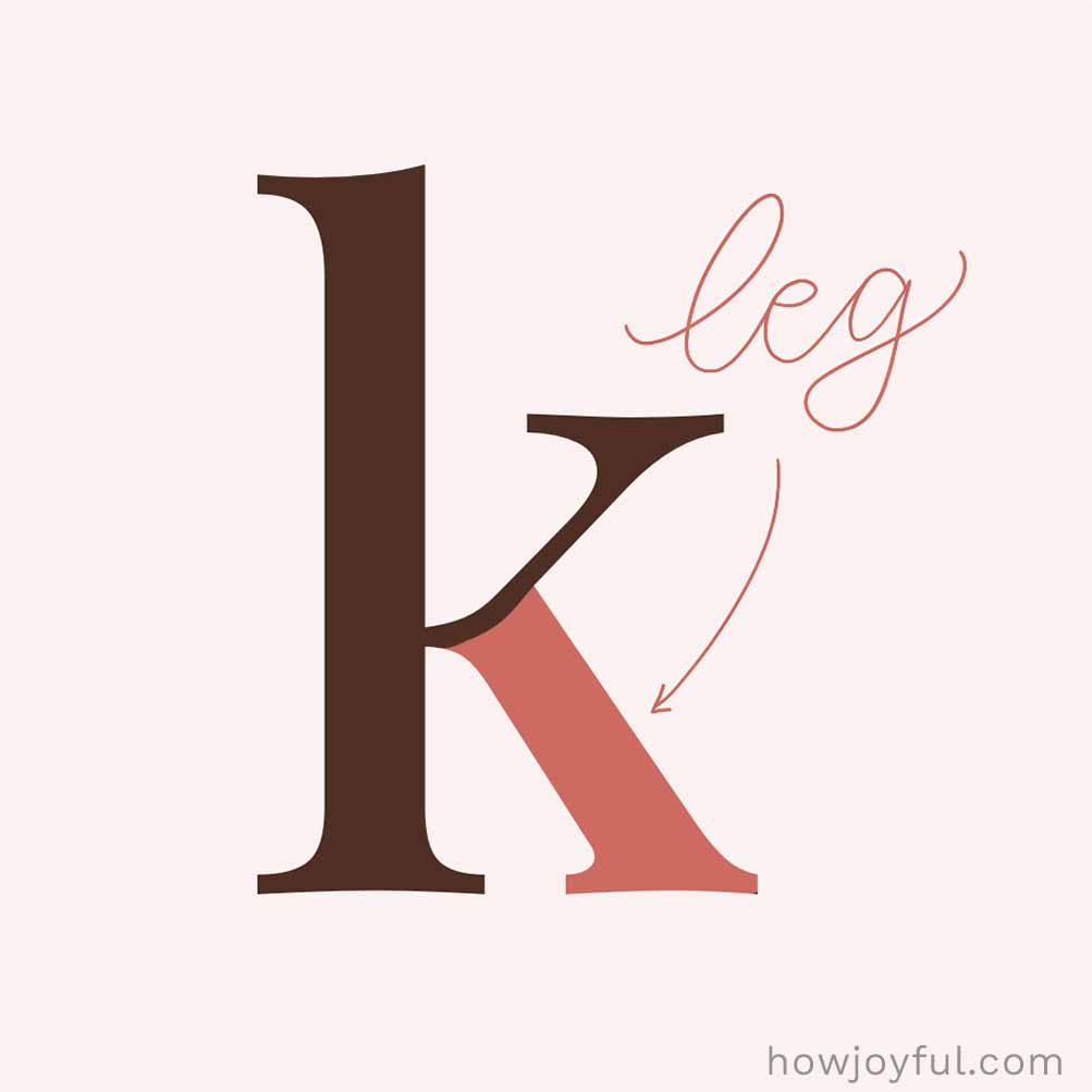

Leg
A short, angled stroke that extends downward from a letter, usually attached on one side and free on the other. It shows up in letters like R, K, and Q, adding both character and clarity to the design.
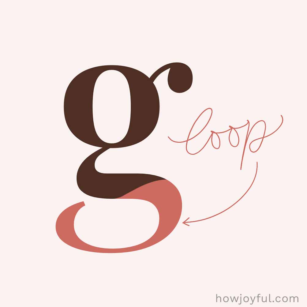

Loop or Lobe
A lobe (or loop) is a small rounded shape attached to a letter, kind of like a mini bowl. Lobes are similar to bowls but typically refer to smaller, attached rounded forms. You’ll frequently see it in letters like g, b, or p, especially in more decorative or script styles.

Lowercase
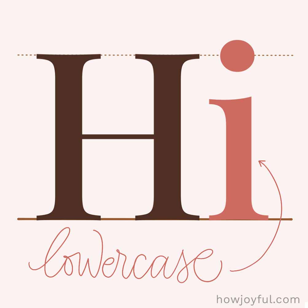
Lowercase letters are the smaller versions of letters, like a instead of A. We use them for most of our writing, while uppercase letters are saved for things like the beginning of sentences and names. The name lowercase comes from old printing days. Since minuscules were more frequent in text than majuscules, typesetters kept them in the lower drawers, making them easier to reach, while the case with the majuscules (the “uppercase”) was above and behind, a longer reach.

Negative Space
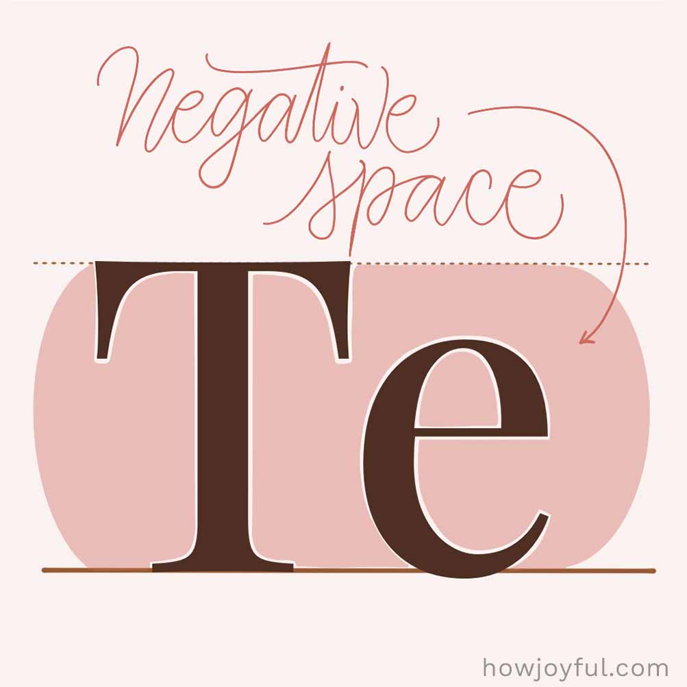
Negative space (or whitespace) is all the empty space around, between, and inside your letters. Sometimes also referred to as “breathing room,” it might seem like “nothing,” but it actually does a lot, helping your text feel balanced, easy to read, and not too crowded. Every so often, what you don’t add matters just as much as what you do.

Overshoot
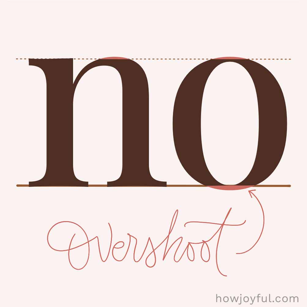
Overshoot is when rounded or pointed letters (think of O or A) extend just a tiny bit above or below the lines. This way, the optically look the same height as flat letters like H or X. It’s a small optical trick that keeps everything feeling balanced and even to the eye, even though it’s not perfectly aligned mathematically.

Readability
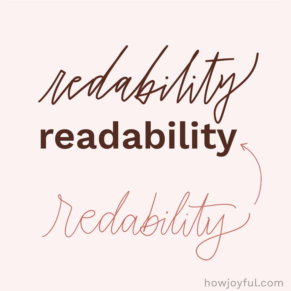
Readability is how easy and comfortable it is to read a block of text. It’s affected by things like your font choice, spacing, and layout. When everything works together—for example, good spacing, clear fonts, and enough breathing room—your text just flows and feels effortless to read.

Sans-serif
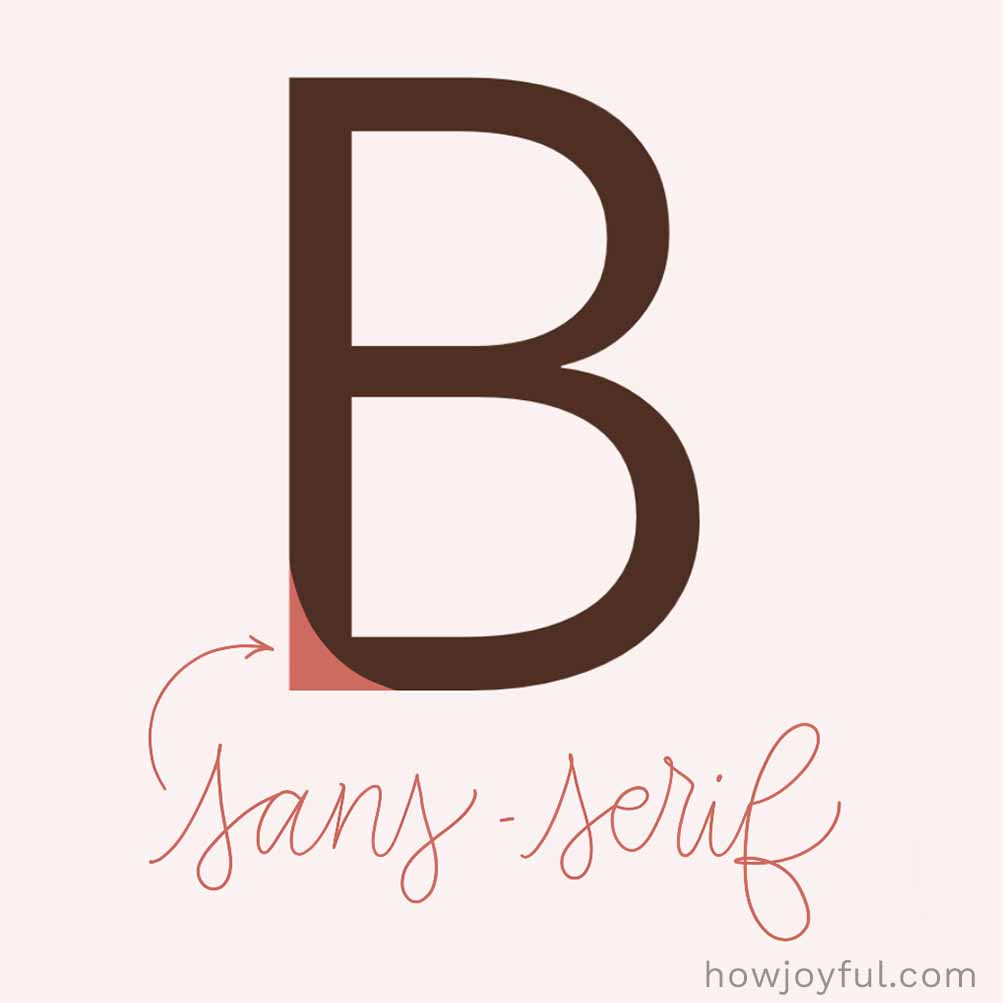
A sans-serif font is a typeface without those little decorative “feet” (serifs) at the ends of letters. “Sans” means “without,” so these fonts have clean, simple lines and a more modern feel. They’re especially great for screens because they’re super easy to read.

Serif
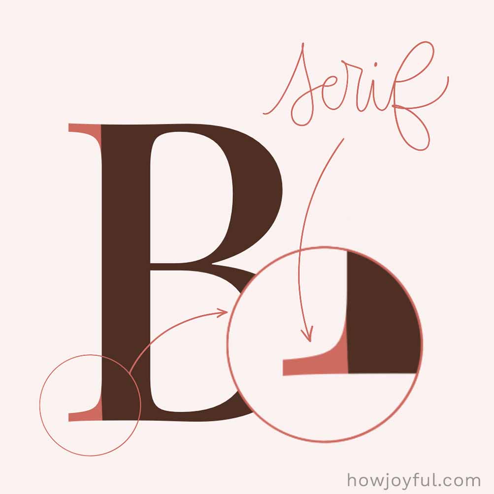
A serif is the little extra “foot” or stroke at the ends of letters. They come in different styles; some are super thin and delicate, others are bold and blocky (like slab serifs), and some have a soft curve connecting them to the letter. These tiny details might seem small, but they can totally change the feel of a font, from classic and elegant to bold and modern.

Spine
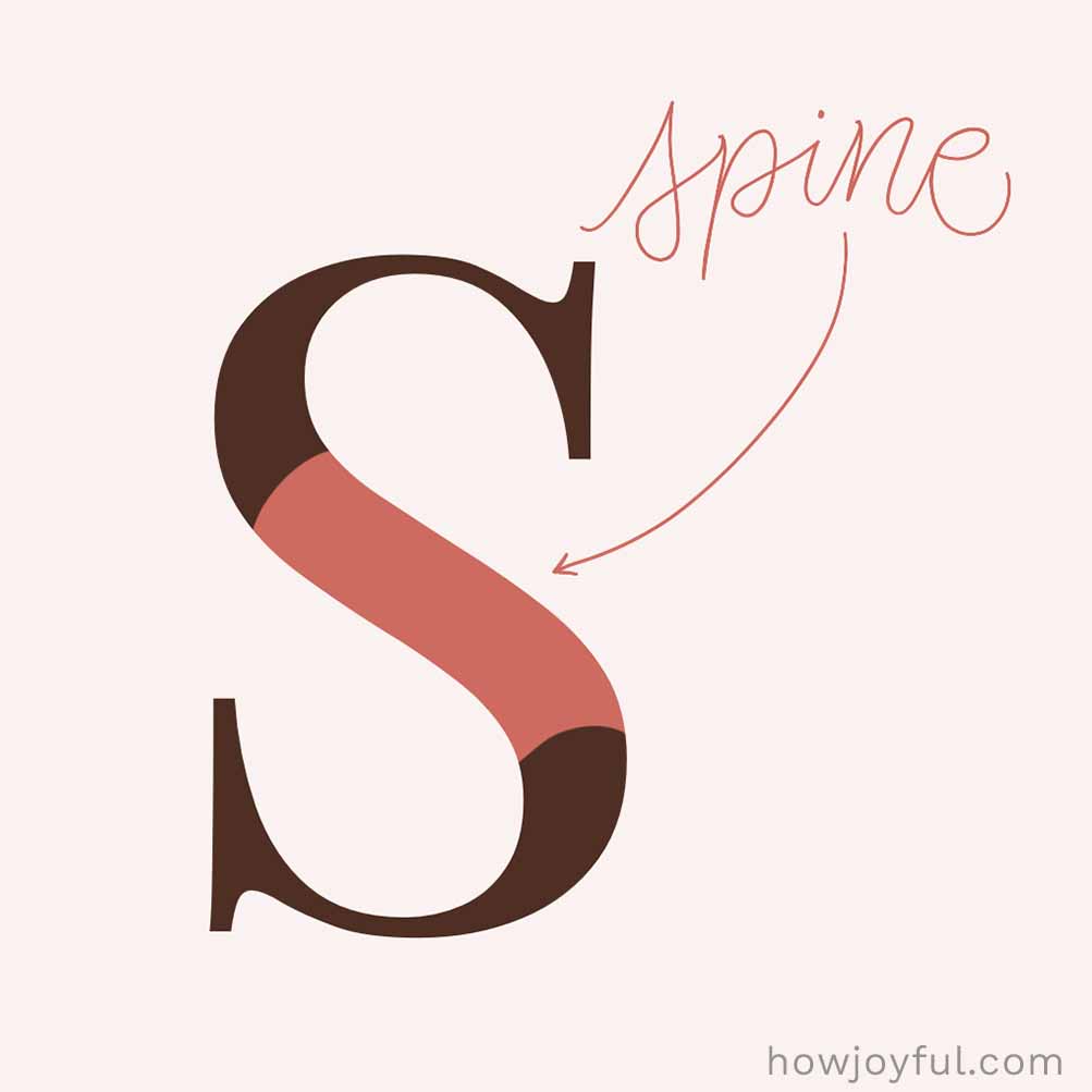
The spine is the main curved stroke in letters like S and s. Depending on the font, it can lean more vertically or stretch more horizontally, but it’s what gives the letter its signature flow and shape.

Stem
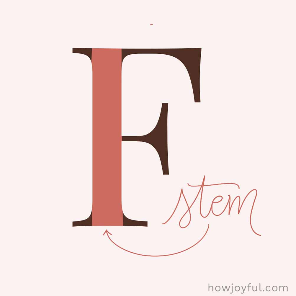
A stem is the main stroke of a letter; while usually vertical, it can also sometimes be a diagonal. It acts like it's backbone. You’ll see it vertical in letters like T, D, B, and diagonal in V. It helps give the letter its structure, weight, and overall feel.
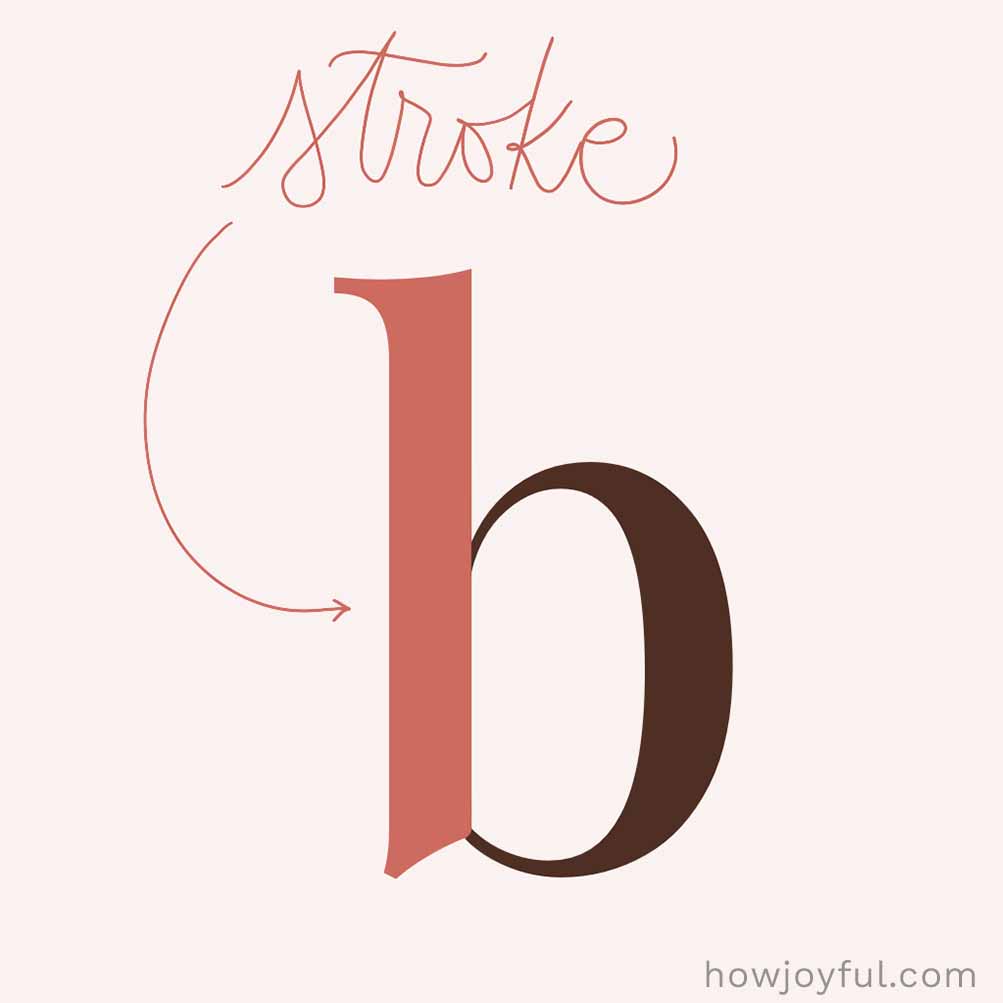

Stroke
A stroke is any line that makes up a letter. It can be straight, curved, vertical, or diagonal. They are the fundamental building blocks of any letter. Some strokes are the main structure (like stems), while others are supporting details. Altogether, these strokes are what build each letter.
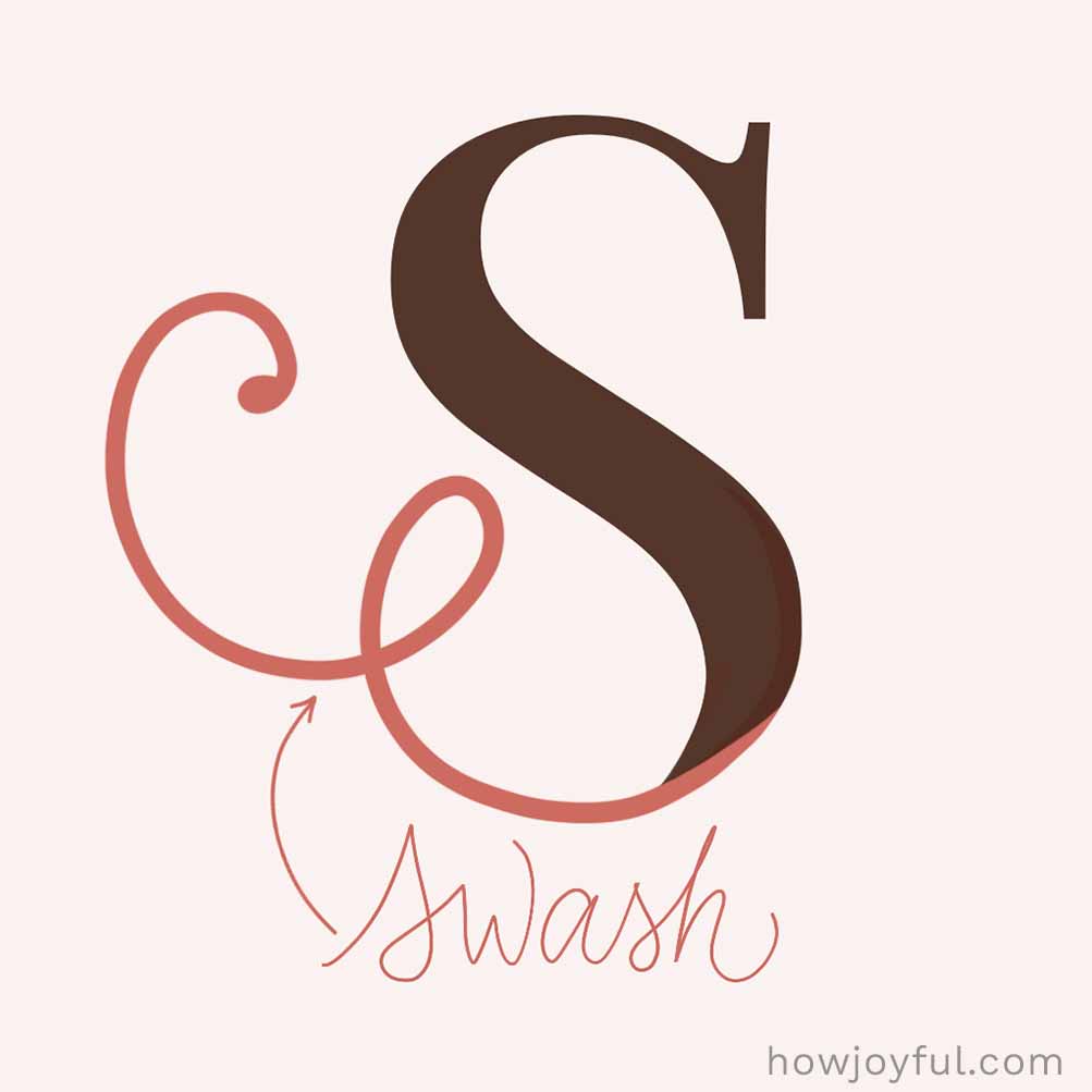

Swash
A swash is a decorative flourish or an extra fancy stroke on a letter; think extra loops, curves, or fancy extensions that add a bit of drama. You’ll often see them on capital letters or at the beginning or end of words. Historically, they were even used to help fill space and make text fit nicely on a line. Definitely one of the prettiest details in typography.
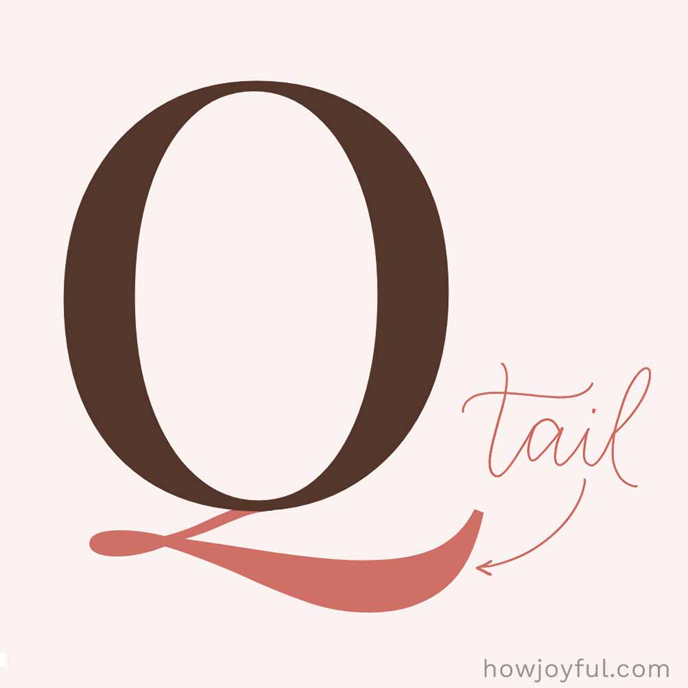

Tail
The tail is the part of a letter that drops down and extends out. Like the swishy stroke on a Q or the diagonal leg on R and K. You’ll also see it used for the descending parts of letters like g, j, p, q, and y.
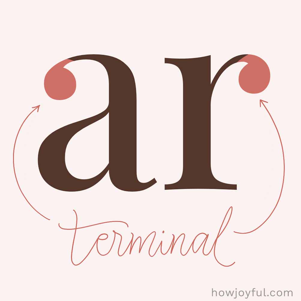

Terminal
The end of a stroke (especially when there’s no serif). A terminal is the end of a letter’s stroke, usually a smooth curve or simple finish (without a serif). It’s one of those small details that can really change how a letter feels. Some terminals are rounded (called teardrop terminals, like in a or c), while others are sharper, almost like a little beak at the end of a stroke. It’s a tiny detail, but it adds so much personality to a font.
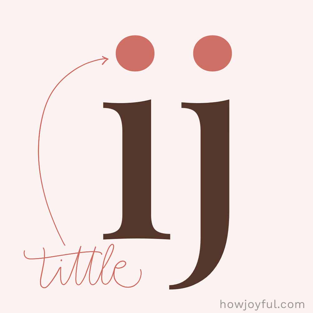

Tittle
The tittle is the tiny dot that sits above the lowercase “i” and “j.” It might be small, but it plays a big role in keeping those letters clear and easy to read. Without it, they’d look pretty confusing (and a little incomplete, too).
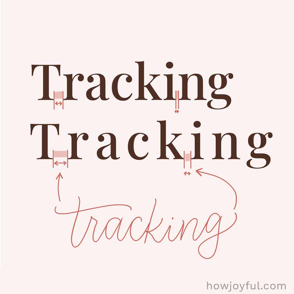

Tracking
Tracking is the overall spacing between letters across a word or block of text. Unlike kerning (which adjusts specific letter pairs), tracking moves everything closer together or farther apart at once, making your text feel more airy or more compact.
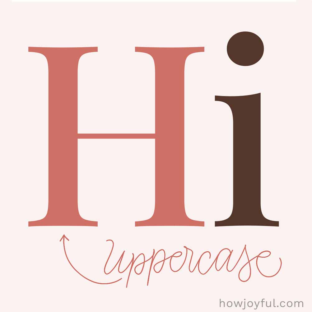

Uppercase
These are your “big” letters, also known as capital letters, used at the beginning of sentences and for names (like people's names, places, and brands). They’re called uppercase because, back in the days of printing presses, capital letters were stored in the top drawer of a type case. While the smaller letters lived in the lower one.
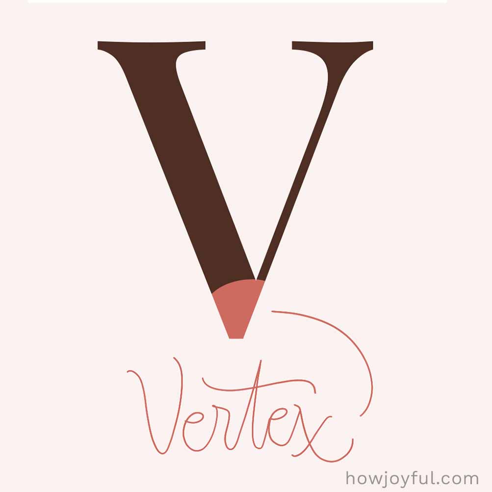

Vertex
The vertex is the point where two strokes meet, usually at the bottom of letters like V, M, or W. It creates that sharp corner that gives these letters their structure and shape.
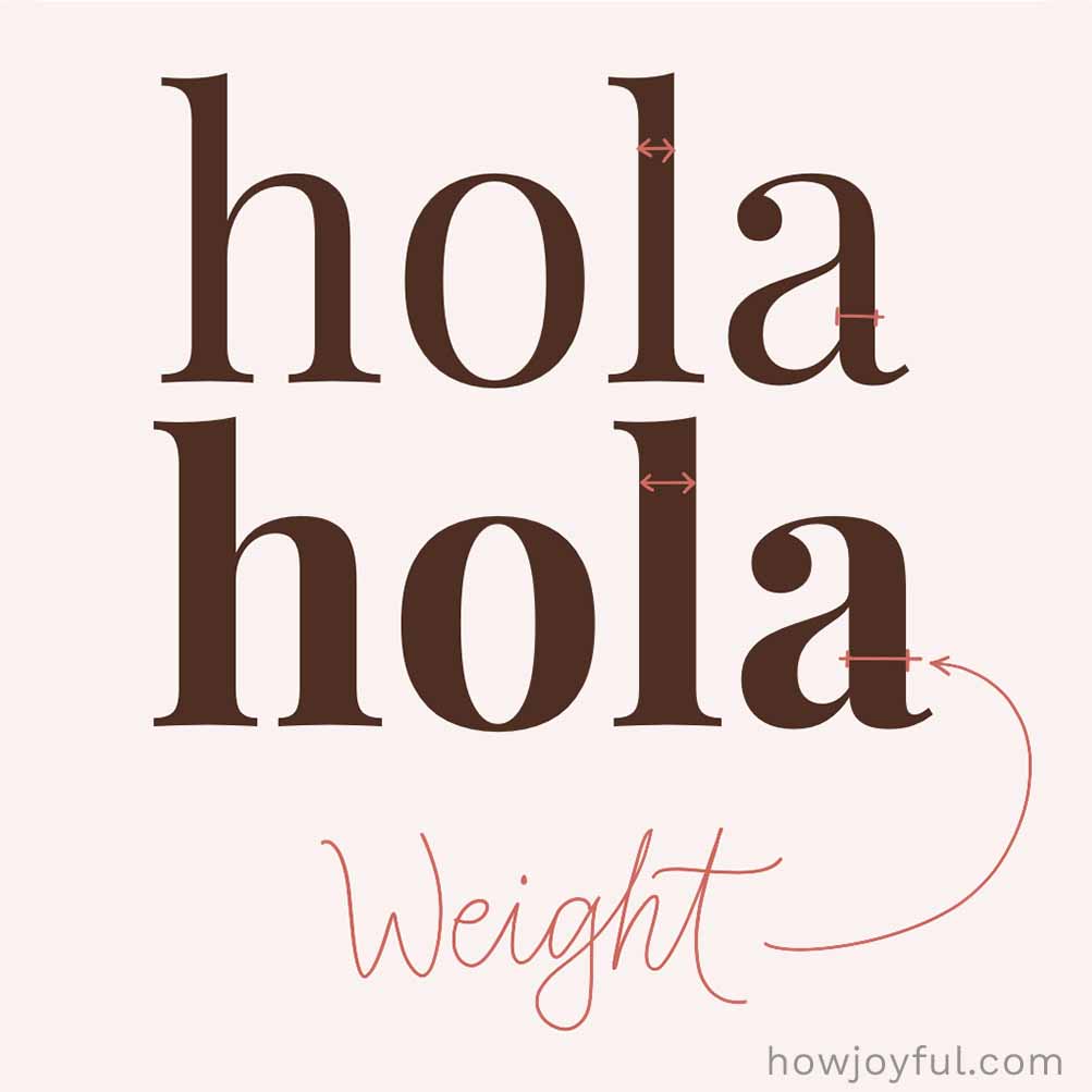

Weight
Weight is how thick or thin a font looks. It can range from super light and delicate to bold and heavy, and it helps create emphasis and set the overall mood of your design. Many fonts come in different weights; think of light, regular, and bold as examples. Each one gives your text an entirely different feel.
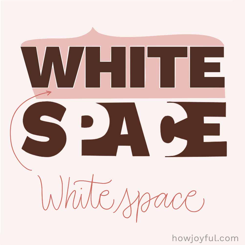

White Space
The white space (or negative space) is all the empty space around, between, and inside your letters. Sometimes also referred to as “breathing room,” it might seem like “nothing,” but it actually does a lot, helping your text feel balanced, easy to read, and not too crowded. Every so often, what you don’t add matters just as much as what you do.
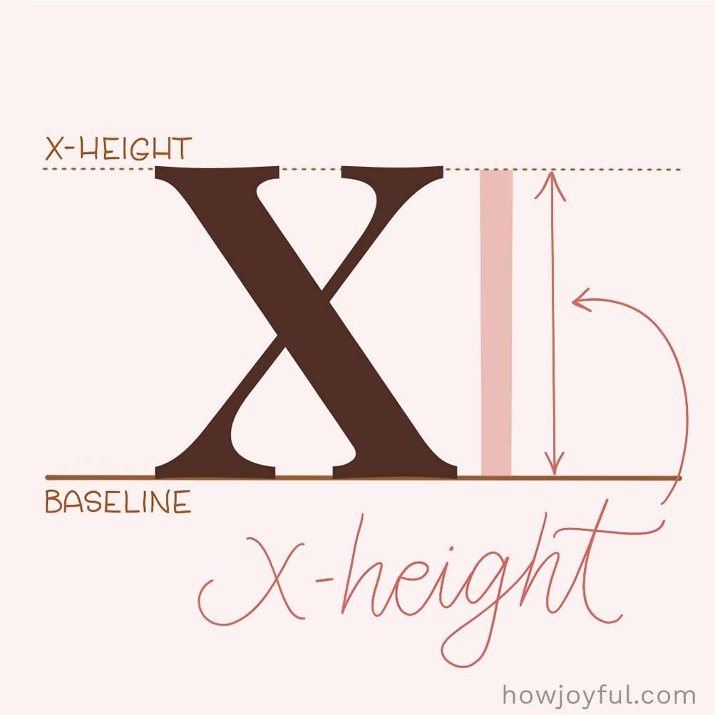

X-height
The x-height is the height of the main body of lowercase letters (like “x”), not including ascenders or descenders. It plays a big role in how a font feels and how easy it is to read. Fonts with a larger x-height tend to look bigger, darker, and a bit more crowded, while smaller x-heights create more space and contrast.
You already know how much I love to share free resources, so I figured that the perfect companion for this glossary of typography would be a cute downloadable poster.
Print it, pin it by your desk, tuck it into your lettering binder, or keep it nearby for your next design or calligraphy project.
It’s perfect for lettering practice, design projects, homeschool art lessons, or just for geeking out over beautiful letterforms with me 🤓. I hope it helps learning typography terms feel a little more joyful and a lot less intimidating.
All you have to do to download is sign up for the HowJoyful News & Letters, our official virtual happy mail! You will also have access to all the other extra worksheets and workbooks that are available for FREE inside the Letter Vault! All you have to do is fill out the box below!
If you are already subscribed, there's no need to fill out the box again; all you have to do is head over to the Letter Vault and download the Typography Glossary.
Looking for more letter-making goodness?
Take a look at these articles I wrote for you:
- Brush Calligraphy for Beginners Guide
- Calligraphy Alphabets: What are Letter Styles?
- The Difference Between Lettering & Calligraphy
- Typography Terminology Glossary
- The Best Brush Pens for Beginners
- 15 of the Best Books for Calligraphy & Lettering
- A Guide to American Cursive
- 25 of the Best Classes for Calligraphy & Lettering
- A Brief History of Calligraphy
- The Best Paper for Calligraphy
- How to Make Passive Income as a Lettering Artist
I hope this typography glossary helps make all those fancy letter terms feel a little less mysterious and a lot more approachable.
Keep it nearby, come back to it whenever you need a refresher, and most of all, have fun noticing all the tiny bits of magic hiding inside every letterform.
Until next time! Have a joyful, creative time!
